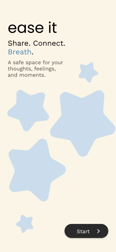
ease it
Share. Connect.
Breath.
A safe space for your thoughts, feelings, and moments.
Role
Product Designer
Duration
4 weeks
Platform
Mobile App
Focus
Mental Wellbeing · Community · Emotional Safety
A safe space to share stories, find inspiration, and protect your peace.
ease it is a wellbeing platform where users can privately reflect, anonymously share their stories, and find support without compromising their peace.
Existing wellbeing apps support reflection and guided help, but often miss genuine human connection and peer understanding.
Existing Wellbeing Experiences
"Misses the feeling of being heard, understood, and supported."
Opportunity
A missing middle between private reflection and guided conversations.
ease it fills this gap.
Based on user research and interviews, a clear pattern emerged in how people experience sharing personal thoughts online for support and connection.
"I don’t always want advice. Sometimes I just want someone to know."
"I don’t want people judging my face."
"Heavy content can make difficult days worse."
"Traditional social metrics feel like a performance."
Users want emotional expression and peer support, but feel restricted by judgment, exposure anxiety, and overwhelming content environments.
The core principles that shaped every design decision
Human Support Over Validation
People often just need to feel heard. Interactions focus on empathy and support, not comparison or popularity.
Anonymous Self-Expression
Users can express themselves freely without revealing personal identity, ensuring comfort and openness.
User-Controlled Experience
Every choice stays with the user, from private reflection to sharing and interaction preferences.
Emotional Safety by Default
Interactions are built to protect emotional safety, letting users control sensitive content, advice, and comments on their posts.
"These principles guided every interaction decision"
A journey from private reflection
to community connection.
Reflect
Initiate sharing
Choose Emotion
Incl. custom emotions
Write
Narrate thoughts
Review
Final verification
Decide
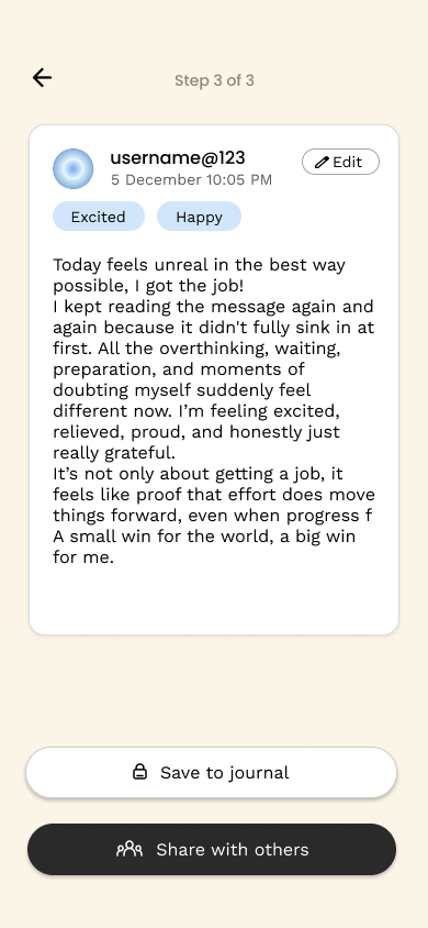
Private / Share
Safety Layer
Final boundary
Community
Find support
"Designed for conscious, intentional sharing."
These decisions define how ease it removes emotional pressure and creates a safe space for expression and connection.
Anonymous Identity System
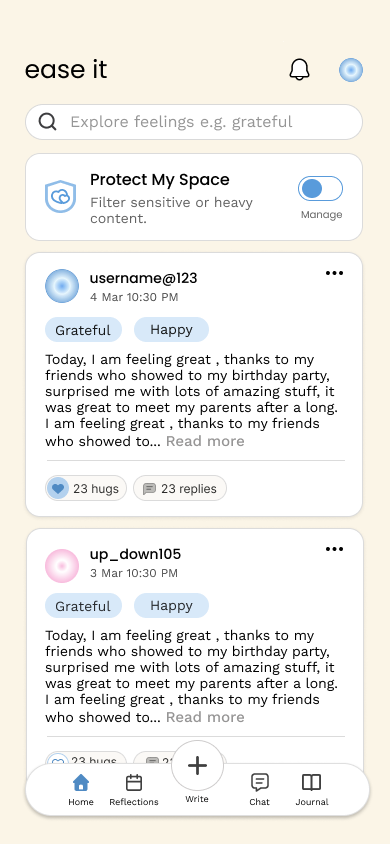
No face photos or follower counts. Users are represented through “Auras” and “Journey Following” instead of social identity.
👉 Reduces identity pressure and comparison culture
Safety Before Sharing
Sensitive content tagging before posting + viewer-side content filters.
👉 Prevents emotional triggering in community spaces
User-Controlled Expression
Users can turn comments on/off per post or choose “just be heard” mode.
👉 Gives full control over emotional exposure and vulnerability
Frictionless Moderation
Simple 3-step reporting with immediate action, no long forms.
👉 Protects users without adding stress during distress
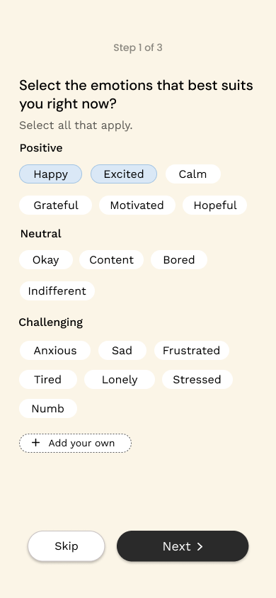
Emotion-First Reflection Flow
Users select their emotion before writing, with a flexible journaling space and review step.
👉 Reduces blank-page anxiety and emotional overwhelm
Support Over Validation
Reactions are replaced with “Hugs.” No likes, rankings, or engagement hierarchy.
👉 Shifts focus from validation to emotional acknowledgment
Designed to reduce cognitive
and emotional load.
The Palette
Cream Background
#FBF5E7
Calming Blue
#277ED3
UI Philosophy
Minimal, calm UI spacing
Generous negative space and a soft color palette work together to lower anxiety levels and keep the focus on emotional clarity.
Identity System
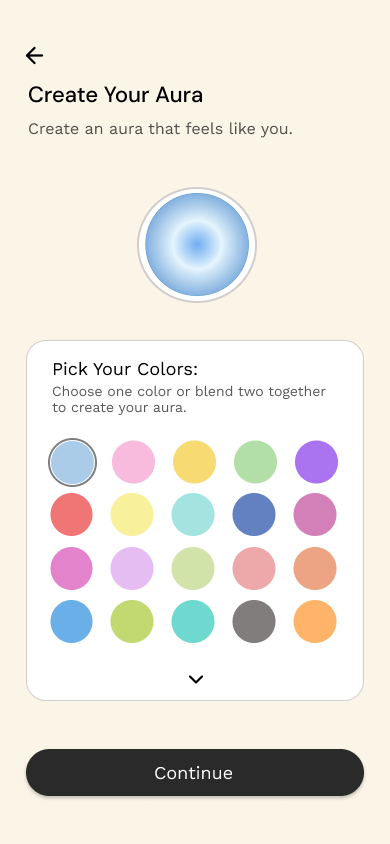
Auras for Identity
The Art of Expression. Instead of personal photos, users choose dynamic, generative auras that reflect their unique emotional journey.
Headlines
Poppins
Sophisticated, warm, and approachable geometry.
Body Text
Work Sans
Highly legible, professional, and contemporary.
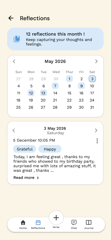
Final Product Showcase
A comprehensive look at the ease it experience.
Learnings.
Emotional UX needs fewer social metrics
Removing likes and followers reduces validation pressure and improves honest expression.
Microcopy changes emotional meaning
Simple shifts like “Likes” → “Hugs” change interaction from validation to support.
Safety must be built-in
User safety should be designed into the system, not added later as a fix.
Less control reduces harm
Fewer, intentional features create a calmer and more emotionally safe experience.
Case Study Crafted by
Dixitha
Product Designer • 2026